Seams, Spans, and Cuts: What Fashion Sequencing and Architectural Flow Can Teach Film Editors
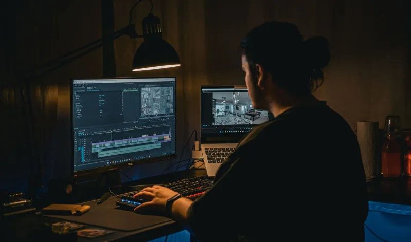
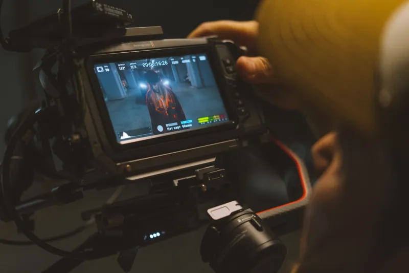
Editors are trained to think in terms of rhythm, pacing, and continuity. They learn from other editors — from the legacy of Walter Murch's rule of six, from the jump cuts of the French New Wave, from the invisible grammar of Hollywood's classical style. These are invaluable lineages. But the creative vocabulary available to any editor is only as broad as the disciplines they are willing to learn from, and two fields that share remarkable structural DNA with film editing are almost never cited in the conversation: fashion and architecture.
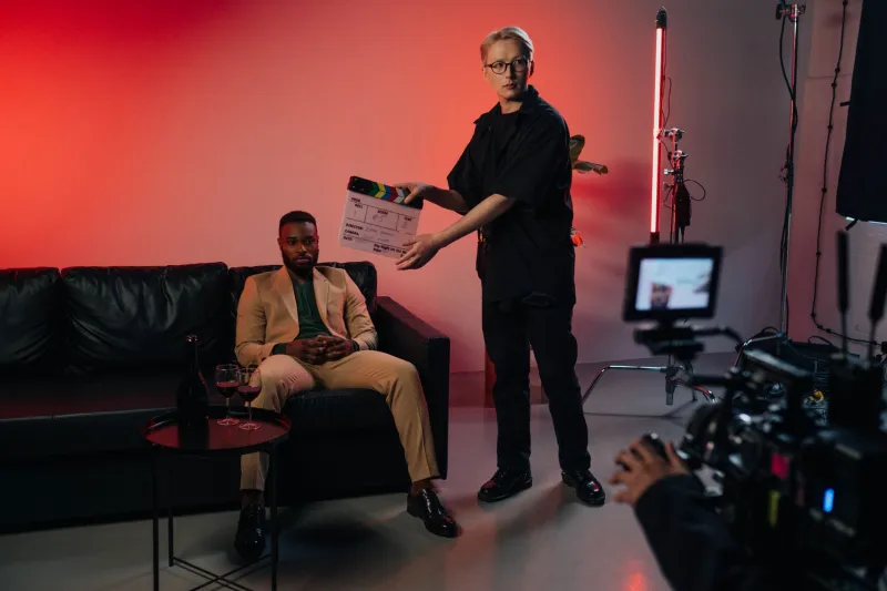
This is not a metaphorical exercise. The principles that govern how a fashion designer sequences a runway presentation, or how an architect choreographs a visitor's movement through a building, translate into specific, actionable editing decisions. What follows are seven techniques drawn from these disciplines, each grounded in the mechanics of the cut and illustrated through US productions where the approach is already visible — whether or not the editors who made those cuts knew where the principle originated.
1. The Runway Opening: Establishing Emotional Tone Before Narrative Logic
Every major fashion show opens with a look that sets the emotional register of the entire collection — before a single narrative thread has been established. The first garment is not the most complex or the most representative. It is the most tonally precise. It tells the audience how to feel before it tells them what to think.
Film editors can apply this principle to the opening sequence of any project. Rather than defaulting to an establishing shot or an expository scene, consider opening with the image or sequence that most purely communicates the film's emotional key — even if it is abstract, even if it withholds narrative information. The opening of No Country for Old Men (2007) operates exactly this way: the Coens and editor Roderick Jaynes use Tommy Lee Jones's voiceover against near-static landscape imagery not to establish plot but to establish mood, mortality, and moral weight. The narrative catches up. The tone was set first.
2. The Collection Arc: Thinking in Movements, Not Scenes
A well-designed runway show is structured in movements — clusters of looks that share a material or tonal quality, separated by deliberate transitions that reset the audience's attention. The show breathes in sections, not in individual moments.
Editors often think scene by scene. The fashion principle invites a broader structural awareness: how do sequences cluster into movements, and how do those movements create a larger arc? The first season of The Bear (2022) is a masterclass in this approach. Individual episodes function as movements within a larger emotional symphony, each with its own internal rhythm, each landing the viewer in a slightly different emotional register before the next movement begins. Editor Adam Epstein and his team constructed something that functions less like a television series and more like a curated collection — unified in vision, varied in texture.
3. The Negative Space Cut: What Architecture Calls a Pause
In architecture, the corridor between two significant rooms is not wasted space. It is transitional space — a deliberate pause that prepares the visitor emotionally for what comes next. Frank Lloyd Wright used compression and release throughout his designs, narrowing a passage before opening it into a soaring room to maximize the impact of arrival.
In editing, the equivalent is the held shot — the frame that breathes before the cut arrives. Editors under pressure frequently cut too quickly, treating every frame as a unit of information rather than a unit of experience. The held shot, the quiet transition, the moment allowed to linger slightly past comfort — these are the corridors of film. Moonlight (2016), edited by Nat Sanders and Joi McMillon, is structured around these pauses. The film moves slowly enough between its emotional peaks that each arrival registers fully. The space between the cuts is part of the meaning.
4. The Silhouette Read: Editing for Shape Before Detail
Fashion designers speak of the silhouette read — the impression a garment makes from a distance, before the fabric, stitching, and detail become visible. A strong silhouette communicates before the viewer is close enough to engage with the specifics.
In editing, this translates to the question of compositional contrast between cuts. Does each new shot read differently in shape and scale from the one that preceded it? Cutting from a wide to another wide, or from a close-up to another close-up of similar framing, collapses the silhouette read — the cuts feel flat. The editors of Mad Max: Fury Road (2015) — Margaret Sixel, who won the Academy Award for the work — maintained relentless compositional contrast throughout the film's extended action sequences, ensuring that each cut delivered a new visual shape even within chaotic motion. The film is almost never dull to the eye because it never repeats its own silhouette.
5. The Axis Walk: Using Movement Direction to Control Tension
Runway choreography is precise about direction. Models move toward the audience, away from the audience, or across the space — and each direction carries a distinct psychological valence. Movement toward creates intimacy and pressure; movement away creates withdrawal and loss; lateral movement creates observation and assessment.
Editors can apply this axis logic to the management of on-screen movement between cuts. Consistent movement direction creates flow; broken movement direction creates tension. Heat (1995), directed by Michael Mann and edited by Dov Hoenig and Pasquale Buba, uses this principle with particular sophistication in its action sequences, where the direction of character movement is carefully maintained or deliberately violated to signal a shift in narrative power.
6. The Material Transition: Matching Texture Across Cuts
In a runway collection, transitions between looks are often managed through material continuity — a silk lining echoed in the next garment's exterior, a texture carried across different silhouettes to create cohesion. The audience may not consciously register this, but they feel the collection as unified rather than scattered.
Editors can achieve the same effect through visual texture matching — cutting between shots that share a surface quality, a grain, a quality of light, or a dominant color temperature. This is distinct from standard color grading. It is an editorial decision made at the level of shot selection. The television series Severance (2022) uses this principle throughout, matching the sterile, uniform visual texture of the work floor sequences to create an almost hypnotic sense of sameness that makes the disruptions of that texture feel genuinely destabilizing.
7. The Final Look: Ending on the Image That Echoes
No fashion designer ends a collection with the most technically complex garment. They end with the look that will linger — the image the audience carries with them out of the room. It is chosen for resonance, not complexity.
The final cut of any film or episode deserves the same deliberate consideration. The last image is not necessarily the narrative conclusion. It is the emotional residue — the frame that will continue to work on the viewer after the screen goes dark. The closing image of The Sopranos — a cut to black edited by William B. Stich — remains one of the most discussed final cuts in American television history precisely because it was chosen for resonance over resolution. It ended not with an answer but with an impression.
Expanding the Editorial Vocabulary
The value of cross-disciplinary thinking is not that it replaces existing craft knowledge. It is that it offers new entry points into problems that traditional frameworks sometimes cannot resolve. When a sequence feels sluggish and the conventional fixes — tightening the cut, adjusting the pacing — are not working, asking a different kind of question can unlock a different kind of solution.
What is the silhouette of this sequence? Where are the corridors? What is the emotional texture I am trying to carry across these cuts?
Fashion and architecture have been solving versions of these problems for centuries. Their answers, translated into the language of the edit, belong in every editor's toolkit.